实现思路
- 使用 Flex 布局展示原图和九宫格图。
- 使用 CSS Grid 创建 3×3 网格。
- 每个网格项使用 background-image 显示同一张图片。
- 通过 background-size 放大图片,模拟整体拼接。
- 使用 nth-child 精确控制每个格子显示的图片区域。
代码实现
1.创建9个格子
html
<div class="nine-grids-image">
  <div class="grid-item"></div>
  <div class="grid-item"></div>
  <div class="grid-item"></div>
  <div class="grid-item"></div>
  <div class="grid-item"></div>
  <div class="grid-item"></div>
  <div class="grid-item"></div>
  <div class="grid-item"></div>
  <div class="grid-item"></div>
</div>
2.容器布局
css
.nine-grids-image {
  display: grid;
  grid-template-columns: repeat(3, 1fr);
  gap: 12px;
  width: max-content;
}
3. 九宫格小块设置
css
.grid-item {
width: 200px;
height: 100px;
background-image: url('../public/img/swiper/1.jpg');
background-repeat: no-repeat;
background-size: calc(300% + 24px) calc(300% + 24px);
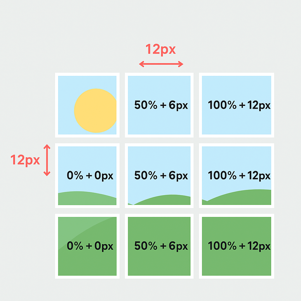
}为了让九宫格中的 9 个小块拼起来,正好能完整覆盖原图,那么每个小块在视觉上是整张图的 1/3 宽 × 1/3 高。
所以整张图片相对于单个格子来说,宽度和高度都要放大到 3 倍(300%)。
4. 背景位置设置
关键在于通过 nth-child 调整每个小块显示原图的哪一部分。
css
.grid-item:nth-child(3n + 1) {
  background-position-x: calc(0% + 0px);
}
.grid-item:nth-child(3n + 2) {
  background-position-x: calc(50% + 6px);
}
.grid-item:nth-child(3n) {
  background-position-x: calc(100% + 12px);
}
每列的横向位置:
- 第 1 列:0%
- 第 2 列:50%
- 第 3 列:100%
6px / 12px 是为了修正 gap 对图片位置的影响。
css
.grid-item:nth-child(n + 7) {
  background-position-y: calc(100% + 12px);
}
.grid-item:nth-child(-n + 6) {
  background-position-y: calc(50% + 6px);
}
.grid-item:nth-child(-n + 3) {
  background-position-y: calc(0% + 0px);
}
每列的纵向位置:
- 第 1 行:0%
- 第 2 行:50%
- 第 3 行:100%
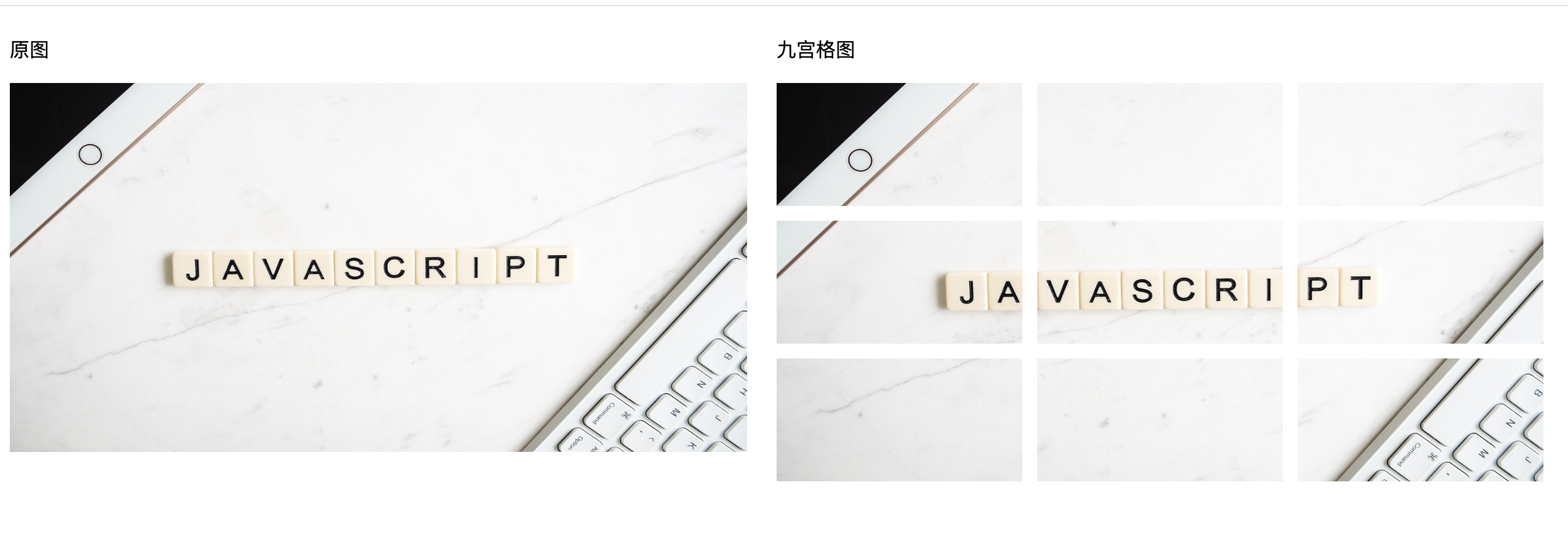
效果图